|
|
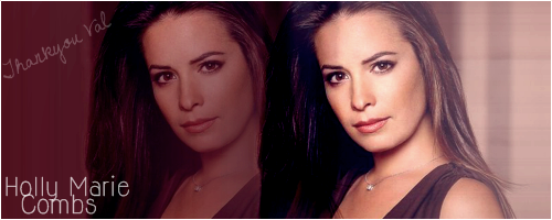
Post by Juels on Feb 15, 2008 16:22:47 GMT -5
thanks val  |
|
|
|
Post by Juels on Feb 15, 2008 18:27:31 GMT -5
 i was bored so i just did 1 more |
|
|
|
Post by HollymCombs on Feb 16, 2008 11:03:06 GMT -5
I like it! One suggestion though. I would suggest that when you resize the images, resize them so that all of the girls faces are similar sizes. Rose and Shannen's faces are perfectly sized, but Alyssa and Holly just seem to far back and separate from the rest. I do like it though! I'm just picking at the little things lol  |
|
|
|
Post by Juels on Feb 16, 2008 11:06:32 GMT -5
thats ok u pick away , you only give out the best advice so its ok i will gladly listen to any other tips |
|
|
|
Post by Juels on Feb 18, 2008 5:58:16 GMT -5
 its not to good could you tell me where i'm going wrong please Val , i know i'm hard work lol this is one done with that softening thing you told me do  not quite got the hang as you can see |
|
|
|
Post by HollymCombs on Feb 18, 2008 11:13:00 GMT -5
I actually really like it! 2 things. One, when you do the text you might want to make the color that stands out a bit more. Also, I think for that banner you maybe should have chosen a brush that was a little bit bigger, but the same style (you probably can just resize it to give it a bit better of a look). And another general tip, for the most part it doesn't look too good to get the brushes on the faces in the banner. If you create a New Raster Layer before you start putting the brushes on, you'll be able to erase the ones you don't like (without erasing other parts of the banner). So you'll be able to erase the ones that land on the faces. Also, I would suggest putting more brushes on the right and left sides of the banner. It just looks a bit empty in the corners, and a little at the bottom too. lol wow that was long. Sorry about that! You're doing a great job |
|
|
|
Post by Juels on Feb 18, 2008 11:18:22 GMT -5
wow that was a lot of info lol , all info taken in i think lol
thanks again
|
|
|
|
Post by HollymCombs on Feb 18, 2008 11:21:08 GMT -5
lol anytime . I hope it helps a bit! I love seeing your improvement  . You've done an amazing job. |
|
|
|
Post by Juels on Feb 18, 2008 11:23:47 GMT -5
thanks , my eyes are not to good so half the time i cant tell if i go on the face's but i will try thanks again |
|
|
|
Post by HollymCombs on Feb 18, 2008 12:06:05 GMT -5
lol sounds good . But even if you can't see the brushes on their faces, you can just go over them with the eraser as a precaution. |
|
|
|
Post by Juels on Feb 18, 2008 17:36:56 GMT -5
hi val ,
got my son to point out where i'd gone onto the face's , and he said i've done it loads lol
sorry teach i will do better next time lol
|
|
|
|
Post by HollymCombs on Feb 18, 2008 18:45:25 GMT -5
lol. It actually wasn't bad at all. I was just picking at little things . I still really like it though! But none-the-less, I'm looking forward to seeing more that you come up with |
|
|
|
Post by Marie on Feb 19, 2008 9:55:05 GMT -5
Oh Juels I love them all, keep up the great work
|
|
|
|
Post by Juels on Feb 19, 2008 15:04:01 GMT -5
  not sure if i have shown these two sorry if i have |
|
|
|
Post by HollymCombs on Feb 19, 2008 16:13:29 GMT -5
I like them! I can tell the first one was a bit difficult to blend (since the backgrounds were so different), but you did a good job with it none of the less.
I LOVE the second one. You did a great job with it! My only suggestion is to make the borders a bit thinner. Maybe set it to around 2. Again, great job!
|
|


 not quite got the hang as you can see
  . You've done an amazing job.