|
|
Post by HollymCombs on Mar 2, 2008 16:22:08 GMT -5
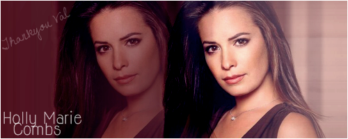
They're great! I personally think that you should have made the brushes a little bit bigger. And on the first one, I love how it came out but my only other suggestion is to maybe make the text color not stand out so much. I usually make the text match another color within the banner (to make it match). Red just seems a little bit random and out of place. But I do like the font you used! One again great job  |
|
|
|
Post by Juels on Mar 2, 2008 16:47:14 GMT -5
ok no red in future lol thanks again for your help and tip's  |
|
|
|
Post by Juels on Mar 3, 2008 7:45:50 GMT -5
|
|
|
|
Post by p3xocharmedonexop3 on Mar 3, 2008 17:24:34 GMT -5
I love your banners! Especially the holly one! great work!
|
|
|
|
Post by HollymCombs on Mar 3, 2008 18:16:15 GMT -5
I love them all! But I especially love the Rose one. Although I will admit I had a tiny bit of trouble reading the text (the "true" part in particular"). Here is a new effect that I'm going to tell you about. It basically makes it so that your text will have a different effect. So what you do is after you write the text and push "ok" on the box, go to Layers--> Properties, and then try out the different effects. Also change the opacity. Sometimes it will give it a cool blended in effect. I like using those properties . Great job Juels! |
|
|
|
Post by Peanut on Mar 4, 2008 4:46:12 GMT -5
I really like your banners, Jules! They're awesome. The text of the Rose McGowan one doesn't fit as green though. It would have been cool if it was a baby pink or something. The banners are really great though and you blend really well. It doesn't seem as hard as it was does it? It's pretty easy once you get the hang of it. If you need any help don't hesitate to contact me okay? Keep 'em comin'! I love them. |
|
|
|
Post by Juels on Mar 4, 2008 7:51:37 GMT -5
thanks for the tips guy's back to the drawing board i go lol |
|
|
|
Post by Juels on Mar 5, 2008 9:32:14 GMT -5
 one more i did please tell me what you think |
|
|
|
Post by Juels on Mar 5, 2008 11:06:31 GMT -5
 sorry to double post Val but i got bored so did this one ,what do you think |
|
|
|
Post by HollymCombs on Mar 5, 2008 15:51:40 GMT -5
They're both great! I think the first one you posted probably should have been done is a slightly larger banner (that way the images aren't quite as squished), but other than that great! And the second one is adorable  . Can't wait to see some more Juels! |
|
|
|
Post by Juels on Mar 10, 2008 15:54:43 GMT -5
|
|
|
|
Post by HollymCombs on Mar 10, 2008 16:26:06 GMT -5
I like them! I especially love the last Leo one. On the first Leo one, there is one part of the blending that it looks like you had a bit of trouble with (between the far left picture and middle picture). Are the white spots on that one brushes? I couldn't really tell. Anyways great job! I love seeing all of your banners |
|
|
|
Post by Juels on Mar 10, 2008 16:29:47 GMT -5
^lol your just to kind ,the leo one is soooo bad lol
yep they are brushes ,lol the wrong one i guess haha
|
|
|
|
Post by HollymCombs on Mar 10, 2008 16:36:39 GMT -5
I am a bit unsure about those brushes, but that doesn't mean the whole banner is bad! I still really like them both . |
|
|
|
Post by Juels on Mar 10, 2008 16:50:01 GMT -5
i think it's safe to say that brush will not be used again lol
|
|


 .
.

